QR Code Makeover: Charlie Yellow Style
QR codes aren’t cute—so I turned them into ice cream. Here’s how I made QR design part of the charm instead of the problem!
I’m currently working on designing my new business card! I want anyone I meet to instantly know that I’m an illustrator who creates fun and whimsical artwork—and hopefully, they’ll want to see more of it too. Designing the card has been a lot of fun, except for one major problem: QR codes are just not cute.
They take up a surprisingly large chunk of space on a small business card. And while my illustrations thrive on organic lines and playful shapes, the sharp squares and perfectly rounded dots of a QR code completely clash with that vibe. To make matters worse, QR codes need high contrast between the code and background to be scannable, which makes them visually loud and totally out of sync with my carefully chosen color palette. It felt frustrating to let the QR code dictate the entire balance of the card.
I looked into custom QR codes, but most options either cost money or don’t quite match my aesthetic anyway—so that didn’t feel right either.
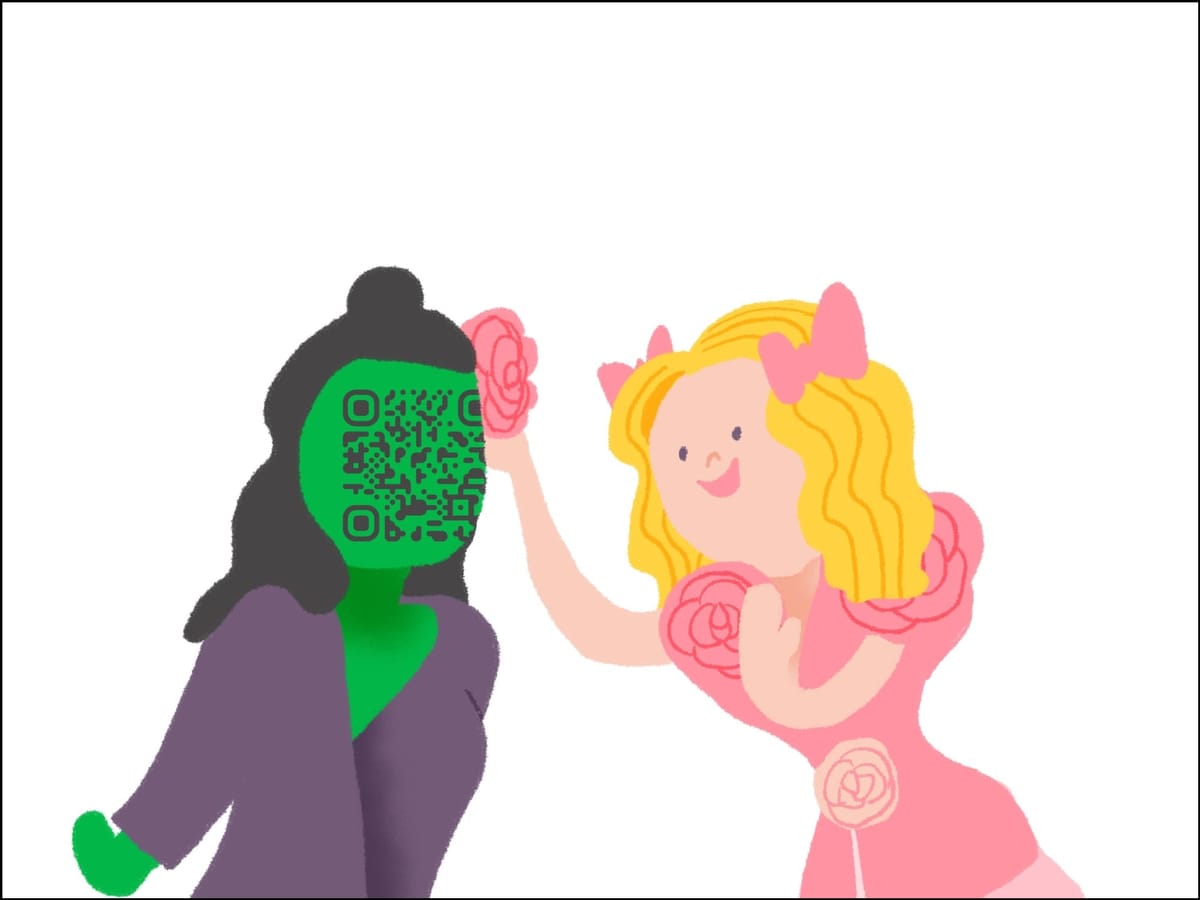
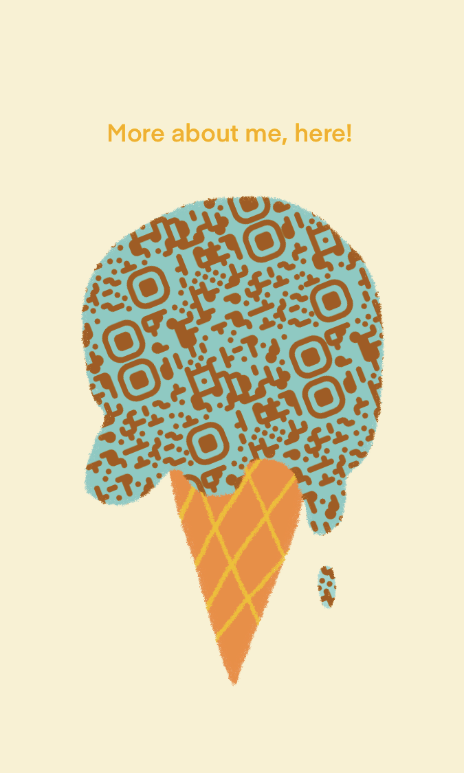
Then I had an idea! What if I took the QR code and repeated it to cover an entire rectangular space, then used a clipping mask to shape it into something playful? By doing that, the QR code becomes part of the design rather than an eyesore.
Here’s my first creation: a choco-mint ice cream cone—made entirely of QR codes.
I ended up making several more versions too!
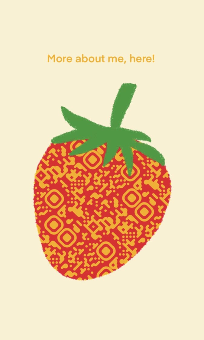
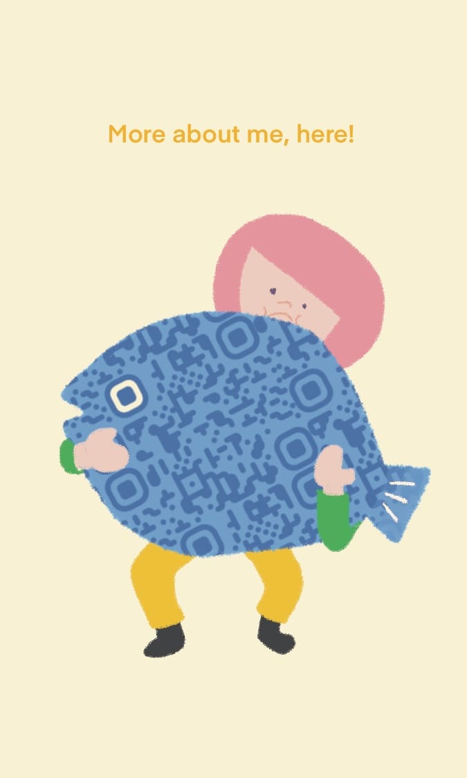
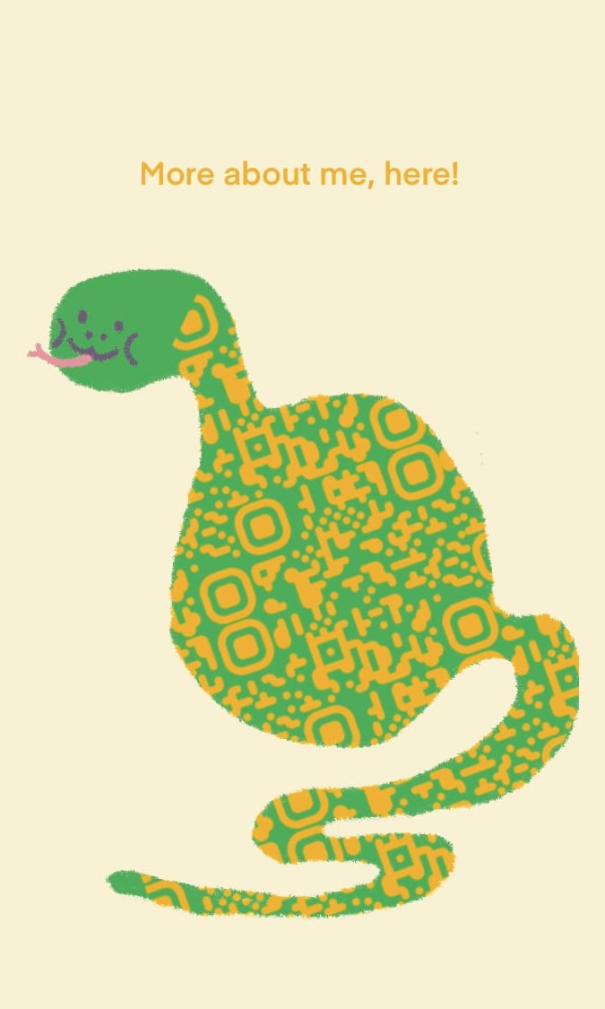
Can’t stop, won’t stop—so many ways to play with QR codes!
A few design tips: don’t shrink the QR code size—it needs to remain scannable. Always make sure a full code is visible—no partial cut-offs. Keep contrast high so your code stays functional!
And that concludes today’s edition of Charlie Yellow’s Design Tips! 🍦